

Mobile Websites & Apps for Healthcare Practices
Designed for the Phone — Not Squeezed Onto It
Most of the people looking for your practice are on a phone, often standing up, often in a hurry, sometimes in pain. We design a separate layout for phone, tablet and desktop — three real designs, not one design that reflows — and it is included with every website we build.
And if what you actually need is an app in the App Store rather than a website, we build those too.
- Separate phone, tablet and desktop layouts
- Included — never a mobile add-on
- Tap-to-call and tap-to-map built in
- Images re-cropped for portrait screens
- Tested on real phones and tablets
- Full mobile app development available
Most “Mobile Websites” Are Just the Desktop Site With the Boxes Stacked
Responsive design is the baseline, and it is genuinely useful — the layout reflows so nothing breaks. But reflowing is not designing. Take a three-column desktop section, stack it, and you get a phone screen with three identical blocks the visitor has to scroll past, a headline sized for a monitor, and a phone number sitting below the fold.
Nothing looks broken, so nobody flags it. The practice simply never finds out how many people gave up before reaching the appointment button. We design the phone layout separately — different hierarchy, different image crops, different order — because the person holding the phone is in a different situation than the person at a desk.
- 3 Layouts, 1 Price
- No Separate Mobile URL
- Nothing Stripped Out
- Tap-to-Call
- Real-Device Tested

Three Designs, Not One Design Stretched Three Ways

Phone
A layout designed for a thumb and a single column of attention. Re-ordered so the practice name, the reason to trust you, and the tap-to-call button are in the first screenful — because most phone visitors never reach the second.

Tablet
The breakpoint almost everyone skips. Too wide for the phone layout and too narrow for the desktop one, so we design it on purpose — and check it in both portrait and landscape.

A Real Mobile App
When a website genuinely is not enough — a patient portal, a membership program, push reminders — we build native iOS and Android apps as a scoped project, quoted honestly rather than packaged.
Designed for the Phone First
A Separate Phone Layout
Tap-Sized Buttons and Click-to-Call
Fast Mobile Page Load
Re-Cropped Images, Not Shrunk Ones
Forms Built for Thumbs
Tested on Real Devices
Get New Patients From Every Device
Busy patients search on the go — in a parking lot, in a waiting room, at 11pm with a toothache. On a phone the whole decision happens in the first screenful, so that is where we put the practice name, the reason to trust you, and the way to reach you. One tap to call, one tap to book, nothing to pinch or zoom.

What’s Included
Phone, tablet and desktop layouts are all part of a standard O360 website. There is no “mobile add-on,” no separate mobile URL, and no stripped-down phone version with half your content missing. One website, three designs, one price.
- A separate phone layout, designed not reflowed
- A separate tablet layout at the iPad breakpoint
- Images cropped for portrait screens
- Tap-sized buttons and tap-to-call numbers
- Forms built for thumbs, with the right keyboards
- Optimized image files for cellular connections
- Testing on real phones and tablets
- Unlimited updates across every screen size
What Designing for a Phone
Actually Means
The difference between a responsive website and a designed-for-mobile website is almost invisible in a screenshot and very obvious in the numbers. Here is what we actually change:
A Different Order, Not the Same Order Stacked
On a desktop a visitor scans; on a phone they scroll in a straight line, and most stop within the first two screens. So the phone layout is re-ordered, not re-flowed — who you are, why you are trusted, and how to reach you come first, and the sections that earn their place on a wide screen move down or come out entirely.
Images Re-Cropped, Not Shrunk
A wide hero photo scaled down to a phone becomes a thin strip of ceiling and a doctor’s forehead. We crop separately for portrait screens so faces stay centered and text stays legible, and we serve smaller files to phones so the page still loads fast on a cellular connection in a parking lot.
Built for Thumbs, Not Cursors
Tap targets sized for a thumb rather than a mouse pointer, phone numbers that dial on tap, addresses that open the map app, and forms with the right keyboard for each field. Small things individually — together they are the difference between a booked appointment and a visitor who gives up mid-form.
Tested on Real Devices
Browser preview tools lie. We check the finished site on actual phones and tablets, at real text sizes, on real connections — including the older device at the front desk and the phone of a patient who has their font scaled up because they cannot read the default.
Phone, tablet and desktop layouts — all included with every O360 website.
The Tablet Layout Everyone Skips
The iPad is the screen most practices never look at — and the one sitting in their own waiting room.
Tablets fall into a gap. They are too wide for the phone layout and too narrow for the desktop one, so on most websites they get whichever is closer and end up with enormous text, awkward whitespace, or a three-column row crushed into an unreadable strip. Almost nobody checks, because almost nobody tests on one.
We design the tablet breakpoint deliberately. That matters more in healthcare than in most industries: patients browse on iPads at home, and it is very often the device in your own operatory or waiting room when a team member is showing someone their treatment options.

- A deliberate layout at the tablet breakpoint
- Not the phone layout stretched wide
- Not the desktop layout crushed narrow
- Portrait and landscape both checked
- The device in most waiting rooms and operatories
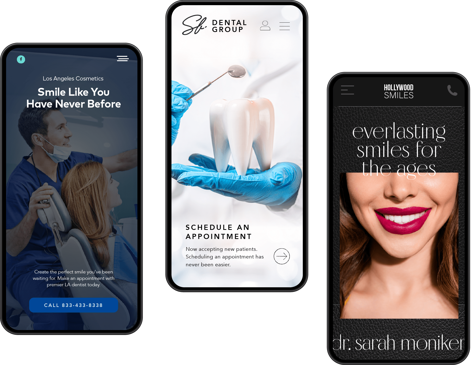
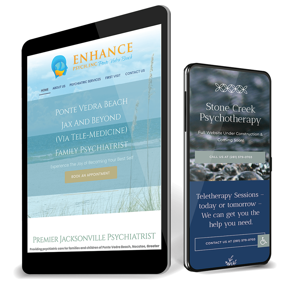
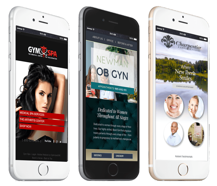
Mobile Designs We’ve Built

Need a Real App? We Build Those Too.
A website that behaves like an app for most practices — and a genuine App Store build when that is what the job requires.
For the large majority of practices, a properly designed mobile website does everything an app would — it opens instantly, needs no download, and shows up in search. Patients will not install an app to book a cleaning, and a good mobile site can be saved to the home screen and opened like one.
But some practices genuinely need more: a patient portal, a loyalty or membership program, push notifications for recalls, multi-location scheduling, or something built around how your practice actually runs. That is a real development project and we quote it as one — scoped to what you need, priced honestly, and built by the same team. Tell us what you have in mind and we will tell you straight whether an app is worth it or whether the website already gets you there.
- Native iOS and Android development
- Patient portals and secure messaging
- Membership and loyalty programs
- Push notifications for recalls and reminders
- Multi-location scheduling
- Scoped and quoted per project — no packages
- Built and supported by the same US-based team
How It Works
You do not order the mobile version separately, because there is no separate version to order. Your designer builds the phone and tablet layouts alongside the desktop one, you review all three before launch, and changes to any of them are unlimited and included for as long as we host you.
1. Designed Together
One dedicated designer builds phone, tablet and desktop as three layouts of one design — so they share a look without sharing a layout.
2. Reviewed on Real Devices
You see all three before launch, on real hardware. If the phone layout should lead with something different than the desktop one, we change it.
3. Changed Whenever You Want
Unlimited updates, included. Send the change to our US-based team and we make it across every screen size — at no additional charge.
Mobile Website & App FAQs
Included. Phone, tablet and desktop layouts are all part of a standard O360 website — one website, one price. There is no mobile add-on, no separate mobile URL, and nothing removed from the phone version to make it fit.
Responsive means the layout reflows so nothing breaks. Designed-for-mobile means someone decided what a phone visitor should see first, cropped the images for a portrait screen, sized the buttons for a thumb, and cut what does not earn its place. Responsive is the floor. We do the second one on top of it.
Yes, and it is the one most companies skip. Tablets sit in the gap between the two layouts, so on most websites they inherit whichever is closer and end up with oversized text or crushed columns. We design the tablet breakpoint deliberately and check it in both orientations — it is very often the device in your own waiting room.
No. Some websites ship a stripped-down phone version with pages missing, which is bad for patients and bad for search. Everything is there. What changes is the order, the hierarchy and the crops — not the content.
Probably not, and we will say so. Patients will not install an app to book a cleaning, and a well-built mobile website opens instantly, needs no download, shows up in search, and can be saved to the home screen and opened like an app. Apps earn their keep when there is something ongoing behind them — a patient portal, a membership program, recall notifications. Tell us what you have in mind and we will tell you straight which one you need.
It depends entirely on scope, so we quote it per project rather than pretending there is a package price. A single-purpose app is a very different job from a patient portal with secure messaging across three locations. Describe what you want it to do and we will scope it and give you a real number.
That is a design decision as much as a hosting one. We serve smaller image files to phones, keep the code lean, and monitor page speed on every site we host — because a phone visitor on a cellular connection in a parking lot is exactly the person most likely to leave.
Sometimes, and sometimes it is not worth it. Send us the URL and we will look at it honestly — if the phone experience can be improved on what is already there, we will tell you. If the underlying build is fighting you, we will say that instead of taking the work.
Yes. Google indexes the mobile version of your website, not the desktop one, so the phone experience is the one being judged — layout, speed, and whether a visitor gets what they came for. A weak mobile site is an SEO problem before it is a design problem.
Want to see how your practice looks on a phone?
Send us your current website and we will show you what it actually does on a phone and a tablet — and what we would change. Then pricing, with all three layouts included. No sales calls. No spam. Quick response.